I have important news for everyone not just interested in cars or automotive design, but everyone with eyes, period: we at Autopian Linguistic Labs and Day Spa have come up with a term to describe the industry-wide automotive design shift that was happening around the late 1980s to the early 1990s: aerosion. Yes, yes, you’re welcome. Let’s describe aerosion in a bit more detail, so you can begin to employ this new term immediately.
Most likely the easiest way to convey the concept of aerosion is with some images, so here’s a few notable examples of the trend:
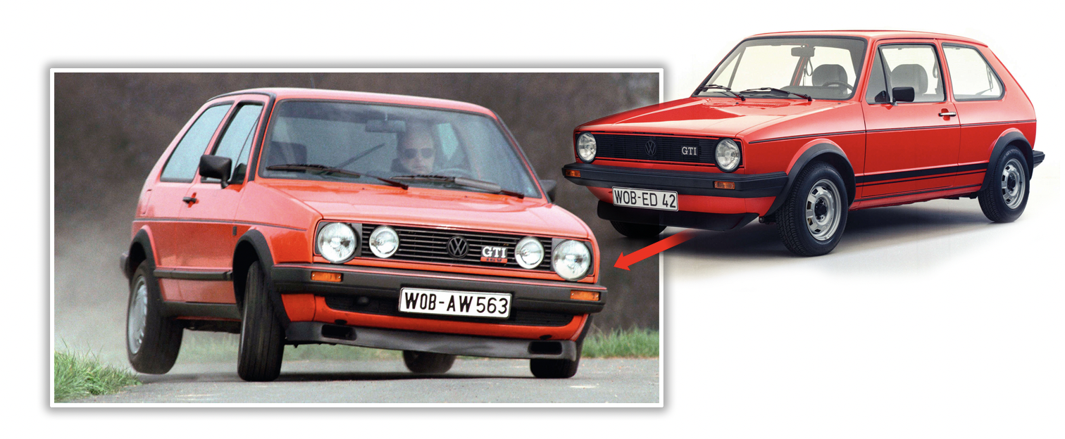
The shift from the Mk.1 to Mk.2 Golf is one of the clearest examples, as the fundamental vocabulary used in the design didn’t change, but the execution did. The basic proportions and details are all still essentially the same, but everything has been rounded and smoothed a bit, like a river stone,. worn smooth by decades of moving water. There’s also a slight inflation effect, as though the original angular car had been inflated like a beach ball.


The move from the Jeep XJ Cherokee to ZJ Grand Cherokee is another great example of this, and shows similar traits: smoothing, inflating, larger, rounder, and now featuring shaped plastic headlamps where previously sealed beams (in this case rectangular) resided.
[Editor’s Note: This isn’t particularly relevant here, but I’d like to point out that the transition to the ZJ also brought about a bizarre beltline “jog” when it hit the hood after it flowed smoothly from the rear along the bottoms of the windows. You’ll see that the XJ doesn’t have this jog; the hood is in line with the beltline — a design that looks better, I think. -DT]
This aerosion period is when most cars (at least in U.S. markets) made the transition from off-the-shelf sealed beam headlamps to custom-for-the-model plastic, shaped units.
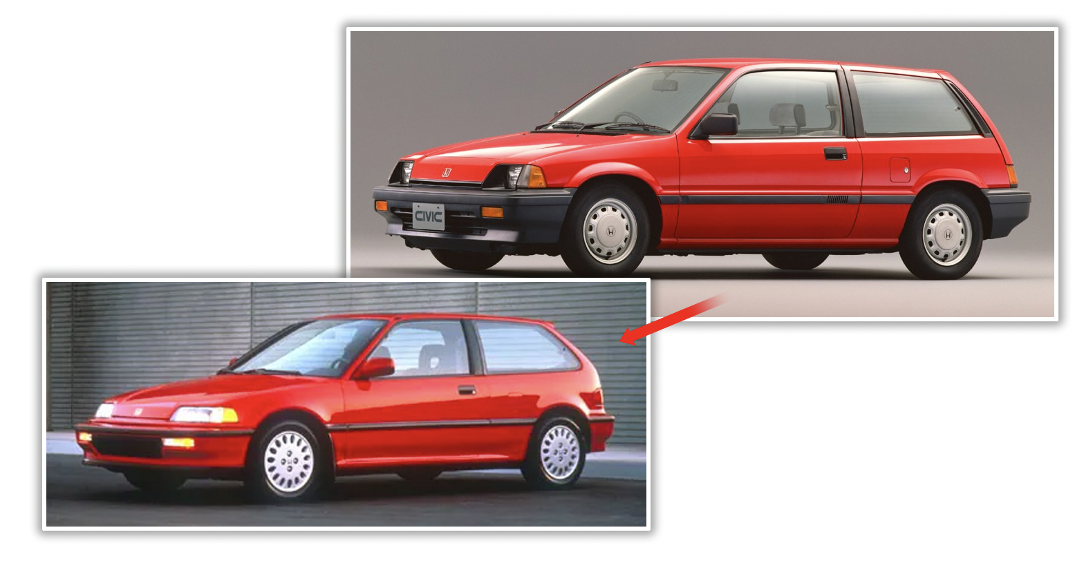

This phenomenon was global; Honda’s Civic went from its third/fourth generation and aeroded into the fifth, fully aerosion-compliant fifth generation, showing all the traits: shaped headlamps, rounded surfaces, plumping, and so on. A more sophisticated understanding of aerodynamics was the big factor here, and it’s remarkable to see how universally similar design changes happened all over the world.
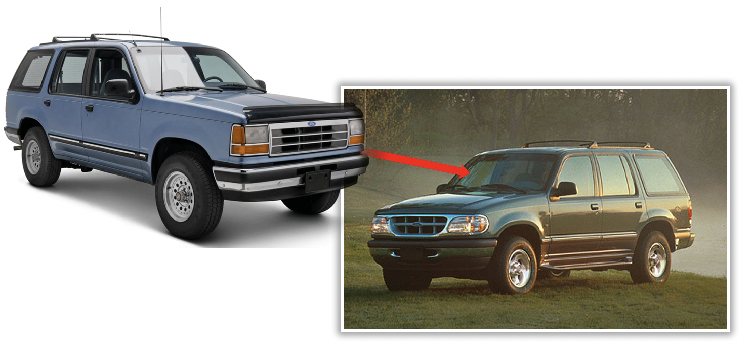
The Ford Explorer is another great example, with its first generation in 1991 being an interesting partially-aeroded design, with custom headlamps that are still mostly rectangular and some smoothed corners, but it took until the second-gen in 1995 for the SUV to become fully aerosion-compliant, with much more rounding, plumping, and dramatically-shaped lighting.
Also note the transition into bumpers becoming much more integrated into the body, in shape and overall design.
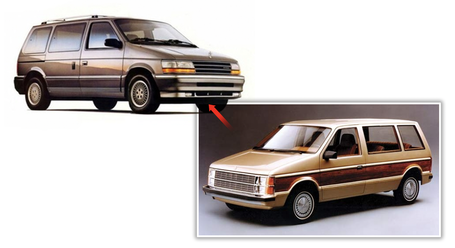

Minivans, of course, weren’t aerosion-averse either, as the original 1984 Dodge Caravan design was completely aeroded by the 1991 shift to the second generation. Sealed beams were gone, there was body inflation, edges sanded into smoothness, bumpers integrated even more with body-colored covers.
The Aerosion Shift was an important one for automotive design, because not only did it set the look for almost every ’90s to early 2000s car, it established so many of the essential traits of modern automotive design, with its significant focus on aerodynamics, fully integrated bumpers, wild freedom in light shapes, and a general unity of form that hadn’t ever really been accomplished for mass-market cars before.
Cars since aerosion have become one smooth primary form, as opposed to a main form with a lot of things (bumpers, lights, trim) stuck on.
Aerosion is a big deal in automotive design, and I’m thankful that it finally has a name.


I have always found the 2nd generation Explorer design to be really attractive, especially the pre-mid cycle refresh ones. I actually miss seeing them on the roads.
Is that Golf really cornering so hard that the rear tire is off the ground, or is that some crazy optical illusion?
Yes, you corner hard enough in one of the rear beam MK2/3s you will three wheel it.
You could just about do it in a mk1 as well-but i ran out of courage trying it with the steel 13s and 12yo skinny tires. An otherwise stock ‘82 4-door would >absolutely< do the peeing dog with 14” snowflakes shod with anything modern-Khumos, iirc
I absolutely _adore_ the word aerosion. Thank you.
Nobody is going to mention the third to fourth generation Chevrolet Caprice?
So my day job is industrial design and surfacing so I’m pretty observant to form, but I am not picking up whatever you’re laying down on this one. Some of the lines are more linear, but … there’s barely any change in most of them. Slightly bigger radii but still pretty linear designs. Should have used the next gens of most of them if you really wanted to talk about jellybeans.
When the 80 series Land Cruiser was brought to South America it earned the nickname Burbuja (Bubble), because of its dramatic Aerosion compared to the outgoing 60 series. It is pretty “bubble” if you look at it that way.
so, Torch…THIS is why you had to chuck up to Michigan, in your moldy cube car?
I think the Camry aeroded the quickest from the 91 to 92 model years.
I remember complaining about this phenomenon when I was a new driver.
Goodby sight lines, suddenly I couldn’t tell where the corners of the car where without some guesswork.
I always wanted to borrow my brothers 89 Camry over My Moms 93 because I hated driving “the bubble car”.
Pretty sure both are still on the road today! I drove next to an EXTREMELY well kept 87 the other day. Bumpers were still black and the paint shined like a diamond.
By modern standards, a third- or fourth-generation Camry offers pretty good visibility, but when I first drove a ’98 I felt like I was going to back over something since my car at the time was an ’89 Volvo 240 sedan.
(Not excusing Volvo, mind – they turned the 740/760 into the 940/960, and that comparison would’ve been similar.)
Not having the front corners wasn’t much of a detriment, but I can see how early Camry Dents™ were formed – by folks used to cars with lower decklids/rear windows and/or sturdier bumpers.
Forgot one of the markets biggest examples: ‘97 Ford F150.
And manly men finally spoke up. They want a manly looking truck.
I submit as the highest and most academically rigorous example of the Aerosionist Movement: The Toyota Previa. Form before function to a layperson. What design were they working from, a solid rectangular cuboid?
In the coming days, can you think of a name for the design trend in the that made so many American cars (cue Buffalo accent) “cleeyassy” in the early 1970s? You know, like the automotive equivalent of a rolling Olde San Francisco-themed casino, wild west bordello, New Jersey banquet hall, or Staten Island house?
You mean like opera windows, landau tops, and velour interiors?
How about ro-coke-oed?
Oh yeah. That, and (excuse me for my lack of knowledge of car styling terms) chrome, crests, huge pointy grills, prominent ridgelines on the sides of the cowl and deck, pillars and taillights shaped like the drawer fronts of an Ethan Allen bureau, wheel covers, excessive character lines — the full Deluxe d’Elegance Custom II treatment.
I like rocokeoed. There’s also “d’eleganced”, “cleeyased up”, and “feeyanceed up”.
To paraphrase Joe Dirt, they were “churched up”
You’re talking about the Brougham Era, that’s usually what it seems to be called now.
Aerosion is such a great word. So much better than obtuse. I think Les Nessman said, “Dull. Without a point. Slightly rounded on both ends.” But Aerosion is the reason. Kudos!
Another pronounced example of this, is the transition from Nissan s13 to s14
No. The S12 to the S13 is the better example.
So, you’re saying that cars underwent “The Plumpening” in the mid-nineties, kinda like me.
I went from hard angles to softened edges.
In many cases, I think it was a good way to subtly modernize a design without putting in the work of a completely fresh shape or losing the cues that said “Cherokee” or “Civic.”
Except in the case of the Taurus, the Funky Oval Riding Device, as I ended up dubbing it.
You mean the third gen Taurus, right? Even the existence of an SHO variant couldn’t save that thing.
Hard to tell which was worse, the nostril-ed front end or the droopy rear (made even worse when equipped with the spoiler).
My parents had one of those. I remember being SO PROUD that it had 24 valves. 24!
My ignorance was vast…. ‘Yeah, it has some pickup, what with those 24 valves and everything”
I’m a fan of aerosion, it had the side effect of making everything look a bit more substantial, probably due to slowly getting rid of flat ’80s surfaces.
Agreed, but the downfall came when stylists started aerodding the trim pieces too.
’80s flat lines could be nicely broken up with chrome or plastic trim to give the design a feel of structure by separating/highlighting different areas, etc. but when that trim then got smoothed and blended in the ’90s, we ended up that shapeless jelly bean appearance that few people liked.
Did you mean the Golf 2 to 3? I don’t see it at all in the 1 to 2 transition. If you told me that picture of those red golfs is just different trim packages, I’d believe you.
I was just going to post this. Having owned both the transition from mk2 to mk3 was much more marked.
Yes I was confused by that example as well.
The Golf 1 to 2 change is a prime example of Aerosion, albeit an early one (1983), so the result was more subtle. This picture makes it a bit clearer I think.
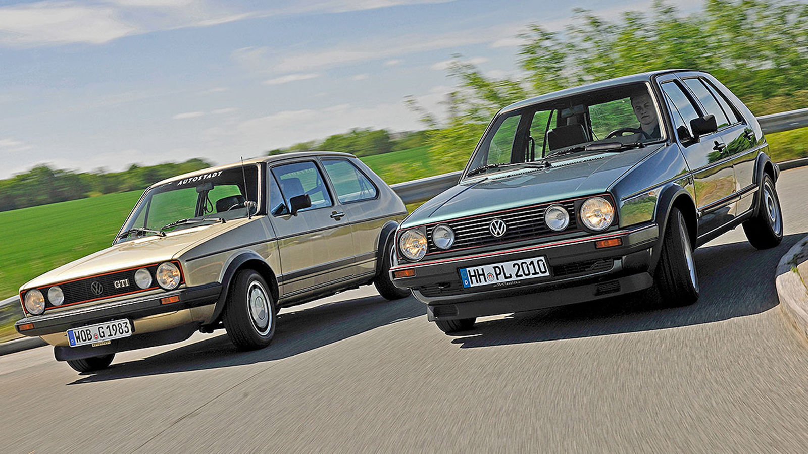
Golf I is all creases and mostly planar surfaces in between (typical 1970’s Giugiaro). Golf II is significantly rounder and heavier, with filleted edges and gently convex surfaces. If you can’t see it we can’t help you. The aerosion from Golf II to III is definitely stronger, though.
I thought it was autoeroticaffixiation
I suppository you are right.
I regularly visit Autopian for all the important news of the day!
Wow this is new. Under history it asks me to log in to comment but under news it shows me logged in.
Still better than Kinja.
I ran into that a couple times so far. I would log in to comment and go back to comment and it would tell me to log in. When I clicked to do so I was already logged in. Had to refresh the page is what I have arrived at as the solution sometimes it takes a couple times? Haven’t figured out exactly what is going on yet
Sounds like a caching issue.
Except you can’t even edit your comments apparently? Like, at all?
This is good Kinja. Oh wait. Good Autopia?
We need a new handle for this.
My favorite model to illustrate the aerosion concept (aka gradually melting soap) is the Nissan Sentra.
Just look at the transition from the late ’80s B11 Sentra

To the early ’90s B13

And then the later ’90s B14:

It’s like watching a block of soap erode as it is used to scrub the unmentionables of a series of automotive stylists.
I always think of it as Taurosion.
A case could be made that it was the styling of the first-gen Ford Taurus that really jumpstarted the trend.
I know Tempo had elements first (JohnTaurus will be all over this if I don’t mention that!), but the Taurus was what really got it noticed as a package.
Ford design in the early ’80s was trying to prepare people for the Taurus really. The Tempo and the ninth-gen Thunderbird were definitely clear indications of where Ford was going.
Actually Audi kicked it off with the 100 (5000 in US).
I got a shotout!!
Yes, the Aerofication (I like mine bette was in full affect at Ford before it hit elsewhere, but the whole world was already headed there.
The Taurus definitely had the bigger impact, the Tempo was a precursor and therefore accommodated sealed-beam headlights. Taurus took it further with more flush-fitting glass (although the Tempo was better than previous cars in this respect) and door handles (that Tempo inherited for ’88).
But Aerofication goes beyond flush grilles and headlights, notice how doors on the ’83 Thunderbird, ’84 Tempo and ’86 Taurus are seamlessly integrated with the roof? Eliminating drip rails and hiding them under the wrapover doors made a subtle, but substantial difference.
Overall, people complain that it’s a “jellybean” shape. But to me, Aerofication results in a cleaner, nicer design that just flows better. Some wore it better than others, but that’s true with anything.
“Overall, people complain that it’s a “jellybean” shape. But to me, Aerofication results in a cleaner, nicer design that just flows better. Some wore it better than others, but that’s true with anything.”
Well… “cleaner,” sure. “Nicer”? Eh. Yes, it “flows better.” That’s what all the wind tunnel testing brought us to. And just like NASCAR’s COF tried to bring us to an idealized place where aerodynamics, and thus speed and handling, were maximized while still barely trying to look something like a “stock” car, so have modern car designs been enslaved to performance and economy standards at the expense, I believe, of visual interest. Which is fine, if you just want to get from here to there as safely, speedily, efficiently, and cheaply as possible. But aerodynamic perfection is more science than art, and there will be a definite mathematical ideal which all the manufacturers will, to varying degrees, attempt to approach. And so we won’t see very many chunks of inefficient eye candy like, say, the Cord 812, or the ’56 F100, or the VW Thing toodling down the roads anymore, but rather a whole bunch of ovoid pods that exit the consciousness as soon as their slippery surface slides out of view. Even that 1994 Ram, certainly as Aeroded as anything else of its era, still possessed a memorably striking presence that recent Rams have lost.
It’s just a subjective aesthetic taste thing. I don’t necessarily prefer things that “flow better.” My optic nerve is not my windpipe.
The day I see people restomodding first gen Tauruses is the day I’ll look up to the sky hoping the Vogons are here to clear us out for the hyperspace expressway.
One of my brothers and I hopped up a first gen taurus SHO, and my other brother and I fiddled around with a 1990 Probe.
BRING ON THE VOGONS!
The aero look really kicked off in Europe in 82-83 with the Ford Sierra and the Audi 100 (5000). The Taurus was 4 years later.
Where does that leave Citroen? DS, CX both Aero designs and much much earlier.
for all their Modernity (with a capital M), the big Citroens were always cars of their time. The DS and CX still largely have separate bumpers and the CX got very angular towards the end of its lifetime. Both certainly had a larger focus on aero than other manufacturers, but this effect of ‘aerosion’ didn’t really hit until the ’89 XM, and even then I’d say that’s pretty early since it is still such an angular car. True ‘aerosion’ at Citroen would probably be the ZX or Xantia, to speak nothing of the egg-shaped disaster that would become the Xsara and Picasso.
Citroën, true to their norms, resisted aerosion and made the XM a jagged spearhead kind of car. Later they made up for this, as pointed out already.
Aerosion also happens with my little one’s wooden toy cars. Sweaty, clumsy palms coupled with sandboxes does the trick.
As a card-carryimg member of the Portmanteau Society, I wholeheartedly support this term.
Also – day spa? Why wasn’t I informed?
If they find out you’re calling them that, the Porsoc is going to revoke your memcard.
Man, I can’t believe you guys didn’t show the best example of this. The 8th, 9th, and 10th generation F-150s.
Pinnacle of Aerosion, especially if you look at the flare side versions.
I would add that even before the aerosion of the F-150, Ford had textbook examples in the Lincoln MKVI to MKVII and its platform-mates ’82 to ’83 T-birds and Cougars. It really is hard to find a more extreme example of going from straight-edge design to bar-of-soap design than these three.
Not just in the US either. I can’t include photos 🙁 but watch the Australian Ford Falcon aerode from blocky straight sheet-metal and huge bumpers in the 1980 XD:
https://en.wikipedia.org/wiki/Ford_Falcon_(XD)
through body-colored bumpers and rounded headlights in the 1984 XF:
https://en.wikipedia.org/wiki/Ford_Falcon_(XF)
plumped and smoothed further for the 1988 EA:
https://en.wikipedia.org/wiki/Ford_Falcon_(EA)
Ovalized yet more in the 1993 ED:
https://en.wikipedia.org/wiki/Ford_Falcon_(ED)
To the last of the E generation, exhibiting all the aerosion traits, the 1996 EL:
https://en.wikipedia.org/wiki/Ford_Falcon_(EL)
And to finish the metamorphosis, one of the true jelly-beans, the 1998 AU Falcon:
https://en.wikipedia.org/wiki/Ford_Falcon_(AU)
^^^ That final Wikipedia article alerted me to the fact that Ford called this the New Edge design language:
https://en.wikipedia.org/wiki/New_Edge
to curved plastic
Exhibit C: 1991/1992 Toyota Camry.
The Crown Vic is another great example. Look at the changes from ’91 to ’92.