I have to say, the Kia-Hyundai-Genesis family is really bringing it design-wise, lately. Over the past couple of years the designs coming out of these companies has been consistently striking and distinctive, with a strong visual identity and cars that just look, well, great. The Hyundai Ionic 5 and Kia EV 6 come to mind. Hyundai’s design team has focused their collective moist designers’ eyes onto Hyundai’s traditional flagship, the Grandeur, and come up with something dramatic and yet restrained, with a bit of 1980s sensibilities we’ve seen in other recent Hyundais.

Here in America, we never got the Grandeur under that name, which is pretty much restricted to Korean markets. Most of the world knows it as an Azera, which I thought was a flowering plant until that person at Lowe’s spit on me. In fin-de-siecle 20th century America, we had it as the Hyundai XG, for those late ’90s Hyundai fans. For most of its life, the Grandeur/Azera/XG was a pretty anonymous-looking full-sized sedan.
Look, here’s a 2011 Azera commercial:

You could slap almost any badge on that thing, from Toyota to Chevy and nobody would bat an eye. It’s fine, but good luck trying to find something interesting about the way it looks.
This new Grandeur, though, is a very different story.

It’s a design that is a bit more upright and less aero-eroded than what’s become the norm recently; while hardly rectilinear, it adapts greenhouse and body proportions from a 1980s car, which I think provides a certain stateliness to it all. It’s a mild fastback design, which is well-punctuated by that triangular rear quarter window.


I actually think that the rear quarter design is perhaps the strongest angle, with some very effective use of body cutlines, like the dramatic diagonal from the rear wheelarch that flows up and into the crease that forms the slight rear spoiler.It’s nice when designers accept that body panel lines exist and work with them, instead of fighting against them or trying to pretend they don’t exist.

That black stripe that runs along the lower body and kicks up as it wraps around the rear is a sort of almost-retro touch, but, again, it works. That lower red reflector? foglamp? at the base of the bumper does feel a bit tacked-on, though.

From the front, we can see the design language that Hyundai calls, with typical PR drama, “Seamless Horizon,” and have even named that full width-DRL after it:

One of the model’s most prominent aspects is its pure volume and excellent sense of proportions that balance premium and dynamic styling attributes. The All-New Grandeur is defined by a Seamless Horizon Lamp inspired by the first light of dawn, accentuating the model’s wide stance and harmonizing with its parametric jewel grill. The Seamless Horizon Lamp is a perfect fusion of technology and art and characterizes Grandeur’s future-focused design sensibility.
I wonder if anyone is actually going to call that a Seamless Horizon Lamp? If called your dealer and tell them you need a strip of LEDs replaced in your Seamless Horizon Lamp, would they know what the hell you were talking about, or would they think you were proselytizing for a cult?

As has been Hyundai’s practice on many recent models, the actual headlamps are in lower-set pods, here integrated into the sides of the grille, which is a full-width crosshatch pattern.

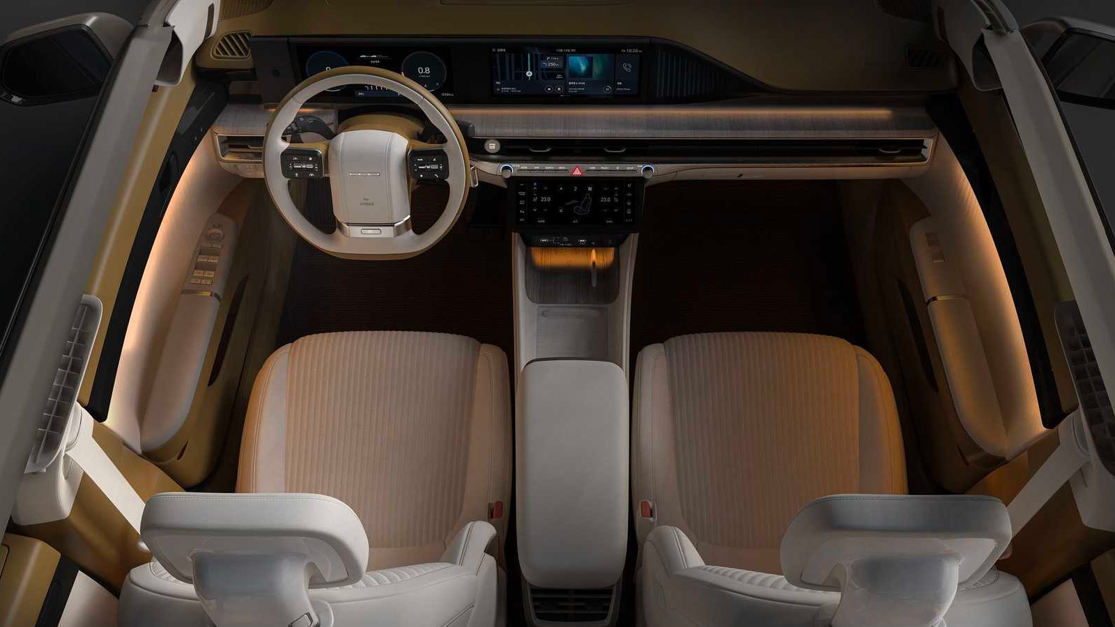
It’s possible this image is hinting at a bold, one-side-totally-open design, but I suspect it’s actually just to show the interior, which is fairly conventional luxury sedan stuff.


The headrests are interesting, though, and like so many other modern designs, the dash is a long, unbroken LCD display, and Hyundai says the steering wheel is “inspired by the single-spoke design of the first-generation Grandeur” for you first-gen Grandeur-heads.

There also seems to be some sort of linear light-effects going on he passenger side of the dash as well, emphasizing the bit of a twist happening on that panel. Also, I’d like to note a nice, simple, mechanical glove box release. See that, GM?
There’s no mention of cost or powertrain details yet, and it’s not clear if this will make it to America, even as an Azera, but who knows? It’s another nice reminder that Hyundai has been killing it design-wise, regardless.


That rear says Continental to me. Am I the only one?
Anyone else getting Muerkur XR4ti vibes? That rear side window is a tell…
Thing is gorgeous, clean, and classy. Bring em over here!
Slap a Genisus Badge on that and get it over to here. Especially given the design directions of MB and BMW, hell even Audi would shit bricks at this and also keep the price about 10k lower and take the win
I like this 1986-1988 Mercury Sable GS sedan.
::squints, googles ‘Mercury Sable wiki’::
Oh my god, all these aero-backed electric sedans (I include the new Cadillac here) really are Mercury Sables! I knew I reflexively hated them for some reason, now I know why.
I actually had to borrow a ’93 Mercury Sable from a friend a few years ago when my car was in the shop (and a rental wasn’t covered under insurance) and actually it’s kind of great? The greenhouse was so open and there was so much glass, visibility was a dream!
I mean, it was still a Ford product of that era, so the seats were a really weird fabric, but it drove fine and I really enjoyed just how much I could see.
So, this would be Hyundai’s copy of a Lincoln MKZ. Gotcha. Cue the ‘delusions of Grandeur’ jokes.
Hyundai are doing great stuff at the same time as showing that the necessity for a corporate “Down the Road Graphic” is complete and utter BS. The DRG obsession has resulted in both (i) some of the ugliest mugs in the history of automobile design across whole ranges of cars and (ii) automakers getting stuck in ruts of either hideousness or blandness.