I feel like in automotive designs, there’s a number of design elements that seem like they get tried numerous times before they actually work. Like the full-width light bar look for headlights and taillights; Cars like the Mercury Sable tried it, but it’s only fairly recently that such elements are becoming successful and even commonplace. There’s one example of a design element that I actually like, but I’m not sure if it’s ever actually, really worked on anything: the Z-shaped D-pillar.
The design itself I think is conceptually compelling: On a wagon-like vehicle, the D-pillar, right behind the second-row side window, is angled rearwards to such a degree that a traditional, visible and upright D-pillar is rendered unnecessary. Instead, the back window wraps around to the side, creating something that looks rakish and sleek. Or, at least it should, but the problem is that I’m not sure I’ve ever really seen it executed just right.
In fact, I think the car that uses this in the most obvious way might just also happen to be the most unanimously-agreed ugly-ass car ever: the SsangYong Rodius:

I’ve highlighted the Z-pillar section in red, but really I should probably have made the whole background of this page vivid, angry red as a warning that I’d be posting pictures of a Rodius on it. Maybe it’s better from the back?


(Spit take entire mason jar of You-Hoo and gin) Oh god, no, it isn’t. Damn. I should have warned you. And me.
Luckily, there’s another very textbook example of this that’s better, and it’s actually the car that got me thinking about all of this, which I saw on a Copenhagen street:

That’s a Mercedes-Benz A-Class (W168) and while I know this design was extremely polarizing, I like how the Z-Pillar rear is handled here.


Even here, though, the design is quite unusual, which is why I’m still not sure this counts as being really successful, because I think I’d need to see it working well on a more mainstream-style and proportioned car. The Chrysler Pacifica minivan flirts with the Z-Pillar, as does the Chevy Equinox, with a forward rake to the diagonal bar, like the Rodius:

I’m just not sure if either of these really lean into the design enough to qualify, or, even if we say they count, are they doing enough with it? Or is it diluted here to the point where it no longer matters?
There’s other cars with diagonal C- or even D-pillars, like the Range Rover Freelander (but does the fact that the rear is a removable roof make it not count? And it has a D-pillar, even if it’s blacked out) or the Nissan Pathfinder or Pulsar NX Sportbak, but neither of them had the wraparound rear glass that’s needed to be a true Z-Pillar.

So my questions remain: has any car ever truly done a Z-Pillar the right way, and if not, is such a thing even possible?
For whatever reason, I think it has to be. There’s something fun and dramatic about the look, and I feel like, with enough concerted effort from the automotive design community, it could be done justice. I mean, it can hardly get any worse, right?


There’s the Seat Toledo Mk3, but I’m not sure it succeeds in, uh, anything it intends to, anyway. No one needed an Altea XL that looked like a Vel Satis.
I like it in the 1957 Rambler wagons
Does the Lexus CT count?
https://pressroom.lexus.com/2016-lexus-ct-200h-compact-impressive-mpg/
“…the most unanimously-agreed ugly-ass car ever” ha! Hold my beer says the Fiat Multipla!
We might have the beginnings of the Z pillar right here. Superior ambulance on a 1959 Cadillac chassis.
http://www.maronline.org.uk/wp-content/uploads/2017/05/caddy-superior-ambulance-1959.jpg
I remember these when I was a kid, thought they were cool ever since.
Depends on how you count but the Jag XJ is a beaut…

The Pacifica has a totally normal pillar, they just cover part of it with black plastic cladding
I think on a more upright vehicle how the A class handled it is perfect, the rear door glass and 3/4 glass need to sweep upwards, otherwise it looks frumpy.
On a more flattened squat vehicle, it can go the other way. A good example would be the Mercedes CLA Shooting Brake.
If you’re going to ask us questions like this, you’ve got to let us post pictures in comments…
While it’s a coupe and not a wagon/box, the Opel Tigra flirts with the look a bit and sort of pulls it off.
The mistake is to judge the Rodius by car standards.
It’s a yacht.
I am making a good salary from home $7580-$9065/week , which is amazing, under a year ago I was jobless in a horrible economy. I thank God every day I was blessed with these instructions,Definitely a try….,
Copy Here→→→→→ https://www.salaryto.com/
First Generation Toyota Sequoia
I get paid more than $120 to $130 every hour for working on the web. I found out about this activity 3 months prior and subsequent to joining this I have earned effectively $15k from this without having internet working abilities
Copy underneath site to check it…. https://worksclick3.blogspot.com/
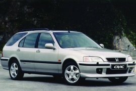
Honda civic Aerodeck kinda managed it not too badly
Also it had roof speakers. A weird place for speakers.
Subaru Impreza, particularly in its Saab 9-2x guise, works just fine.
I’ve been making 100 Dollars an hour since I started free on the Internet a half year earlier. I work expanded periods day to day from home and achieve the fundamental work that I get from the business I met on the web. share this work for you opportunity This is definitely the best work I have anytime wrapped up
go to this association……. https://proweboffers01.netlify.app/
A “Z pillar” should only exist on a limousine with at least 52 usable doors.
ABCDEFG….
it looks fine. In the case of the rodius, the problem is the character line and anything below it.
“The Z pillar? That’s waaaay back there.”
Said the driver of the longest car ever.
LOL! That just snuck up on me. Not quite a joke grenade, as it only took me a couple of seconds.
All Z pillars are ugly. But not quite as offensive as the fake windows that are just tinted glass over metal. Heavily tinted windows are no longer optional because the windows are so hideously ugly.
I don’t think the sharp corners of a Z pillar work with rounded edges or rounded rear. A Volvo Wagon or a SUV with a raked out top slowly coming back in as it descends would match up better. Not sure if its been tried as that top being out further look has dissapeared before SUVs.
I don’t know if it counts because it was removable, but my brain went to the Nissan Pulsar NX with the station wagon roof option installed. It looks pretty good imho.
I think it works best when there is not a lot of emphasize on the “Z”. Designers try to make the “Z” as the lone standout feature of a car, and it just messes up the lines. Take a look at a Opel Rekord P1 with one tone color. The “Z” is there, but just another nice detail amongst others. If you put the “Z” on an estate car, it will invariably be bigger and feel out of place. Somehow, that A-class works very well though.
So, after reading this, I’m convinced that any flirtation with the Z should count – if it is about design, and not structure, I think if it evokes the Z on you, it is enough. Less is more! Anything as egregious as what we see on the SsangYong is just too over the top – like two inch thick eyebrows, or puffy, silicon filled duck lips!
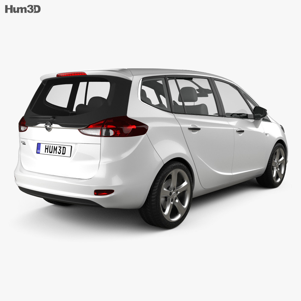
With that in mind, I decided to look at my car’s butt – an Opel Zafira, the same model I use as a banner on my profile. And lo and behold, it kind of has a Z in there! Actually looks more like a 5, and the most interesting element is that the tail light is part of the composition. I can’t post pictures, but I’ll put a link in a reply to this comment.
Of course, being this MY car – that I chose myself, among four other options, because I like the design – I’m partial to it. But I think it pulls it off, very well. It still has a big fat C pillar, but the rear glass is bulbous enough to (in my opinion) sell the illusion of a Z (or 5) – all this without screaming on my face about it (and bonus points for being stealthy and using the tail lights to achieve the effect). The very fact that I had to look for it, in my opinion, qualifies as a good design.
Here is what I’m talking about:
