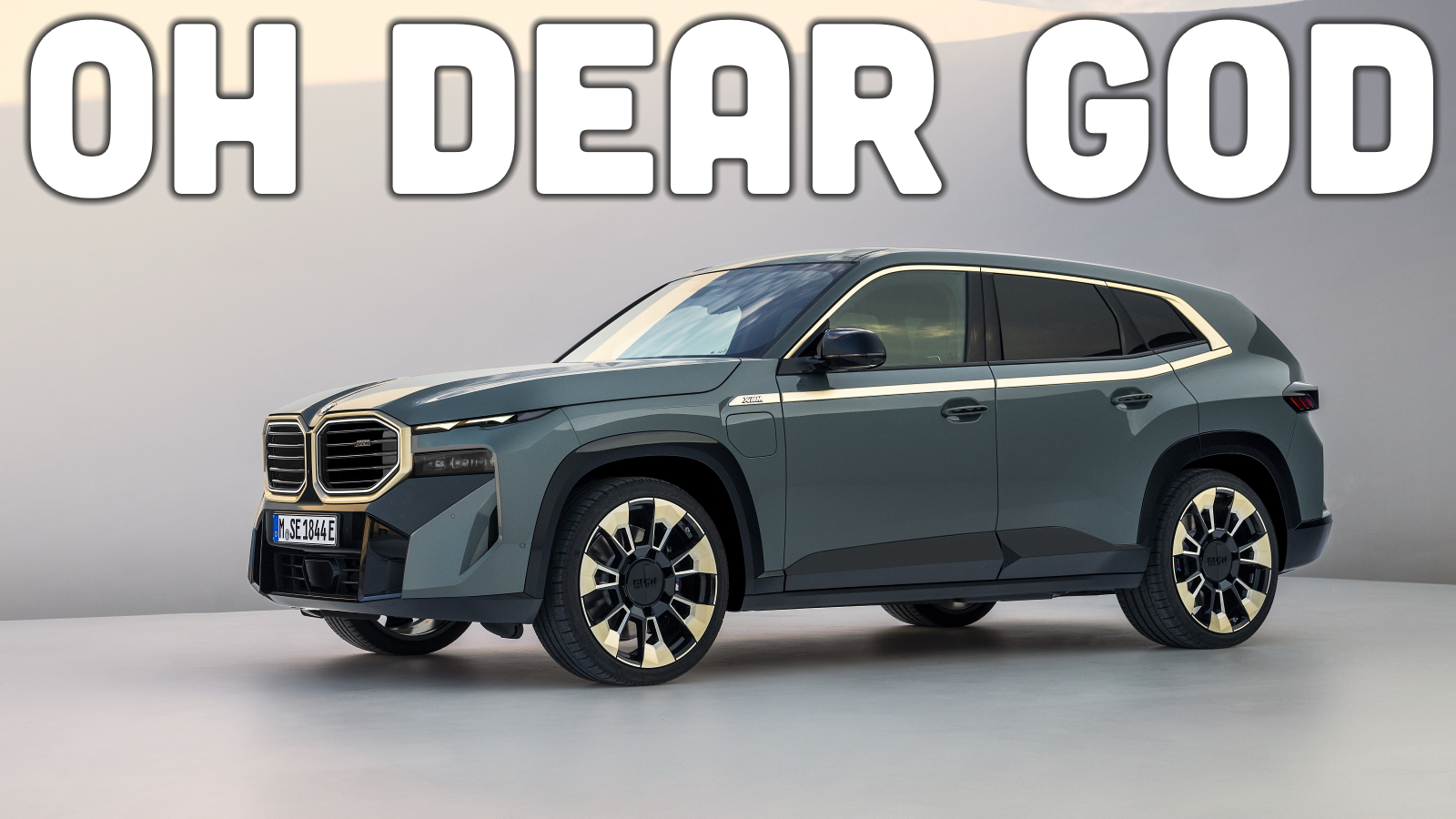
You might want to ask your children to step out of the room, lest they be frightened by the sight of this behemoth. This is the new BMW XM, and although it may look bad, I promise that its appearance isn’t its most troubling part.

Upon seeing leaked photos earlier this year, I had hope that maybe the XM wouldn’t look so bad. There’s a chance that under the protective wrapping, BMW cleaned up some of the fussy details on the front clip. Nope. Claus Luthe is rolling over in his grave so violently that Olaf Scholz could hook up a generator and use Luthe’s corpse to solve the German energy crisis. It’s like the design team was given a budget of eight pixels and told to make do.
While there are some interesting ideas on the XM when viewed in a vacuum, the composition leaves much to be desired. Chicken vindaloo tastes good, and a milkshake also tastes good, but I wouldn’t want a chicken vindaloo milkshake, if you catch my drift. Also, these wheels look like they’re from a Hummer H2, just scaled up to cartoonish levels through the Xerox. The standard front tire size is 275/35R23, which seems a bit stupid. Do you really want an SUV with just 3.8 inches of sidewall?

Things aren’t any better in the power department. Care to guess how much the S68 twin-turbo V8 makes in this application? Nope, just 483 horsepower. That’s 40 horsepower fewer than the X7 M60i. The XM’s detuned S68 is, however, assisted by an electric motor, which earns a dismissive wanking gesture from me. While electric assistance of 194 horsepower is fine, and peak combined output of 644 horsepower is more than an Alpina XB7 makes, BMW’s committed a cardinal sin here.
See, electrification is very heavy, so it only makes sense to use a lighter gasoline engine if you’re seeking reasonable range and performance from a plug-in hybrid. Something like the S58 inline-six found in the BMW M3, for example. BMW has instead gone with a fairly heavy V8 to pair with a 19.2 kWh battery pack, which means that the XM weighs 6,062 pounds. I repeat, 6,062 pounds.


In an attempt to counteract the massive curb weight of the XM, BMW’s fitted it with four-wheel-steering. That explains why the steering ratio is a rather slow 16.2:1. However, four-wheel-steering likely won’t be able to overcome the laws of physics. Trust me, there hasn’t been a single three-ton vehicle I’ve driven that hasn’t felt its weight in the corners. Oh, and heavy cars take a lot of energy to move, which explains why the XM has a projected all-electric range of just 30 miles from a relatively capacious battery pack and the same 4.1-second zero-to-sixty time as an X5 M50i.

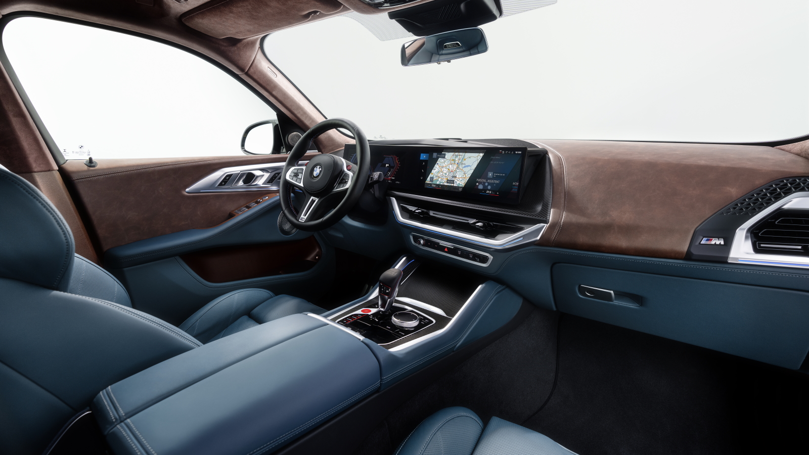
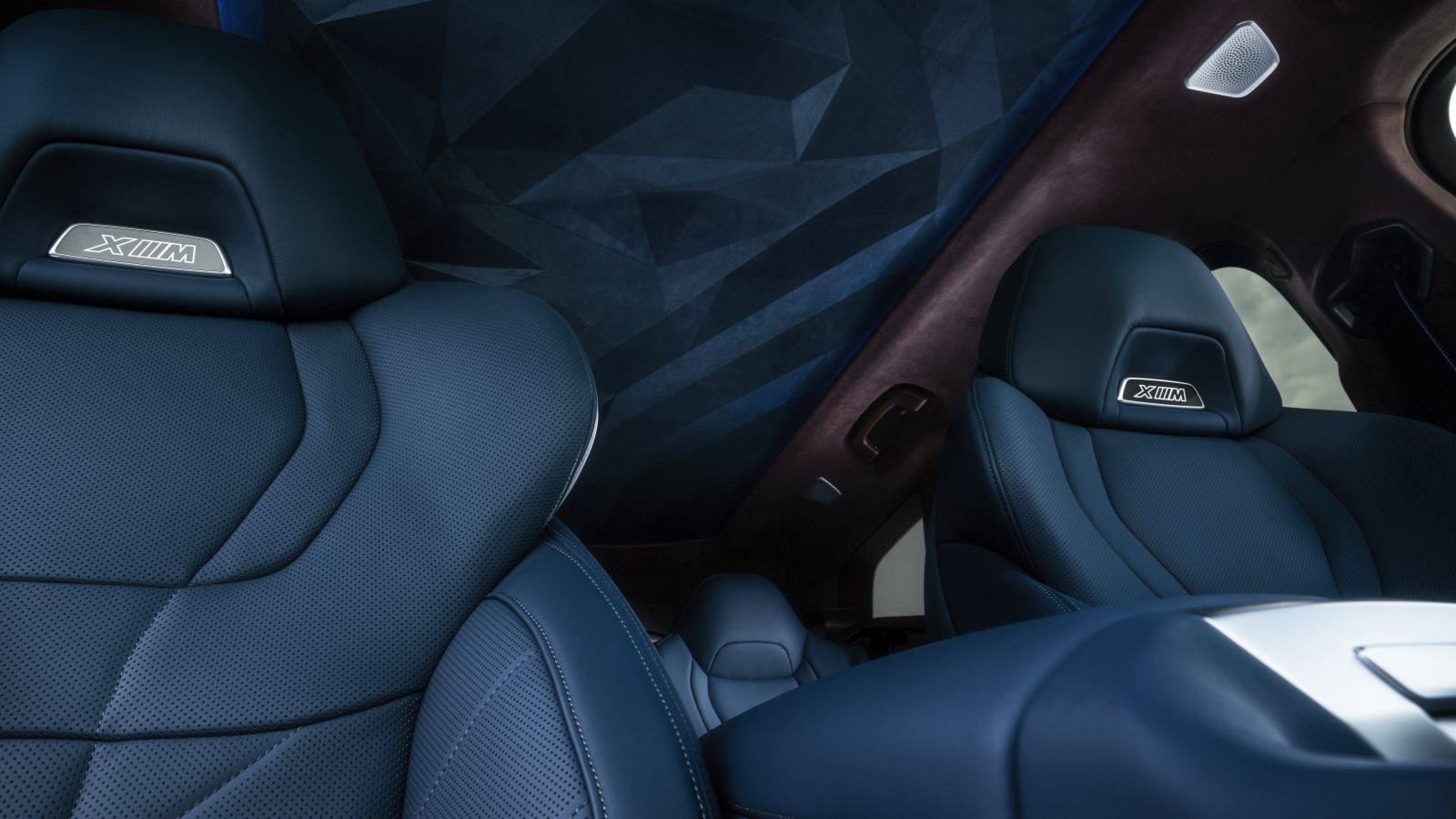
While BMW’s pumped out some really innovative interiors lately, the interior on the production XM isn’t one of them. The dashboard is a fairly standard mix of leather, metal, and plastic, nothing like the crazy illuminated trim seen on the new 7-Series. While the color combination shown in the press photos is certainly outlandish, BMW isn’t exactly known for only offering reserved interior colors. The blue-and-yellow combination on the new M3 comes immediately to mind, as do some of the crazier Individual program requests. The only really interesting thing going on in here is the prism-like Alcantara headliner. A bit of a shame considering how much further BMW could’ve taken things.

So, let’s recap. The BMW XM is no quicker from zero-to-sixty than an X5 M50i, has a turbocharged V8 engine less powerful than the S58 found in the M3 Competition, weighs as much as a rhinoceros, and looks like some horrible accident happened to the clay model. This isn’t an Ultimate Driving Machine. This is a hideous, warthog-nosed, bloated, 6,000-pound oaf of a vehicle, designed to be bought by people you’d never want round for dinner. What’s more, this is supposed to be BMW’s centerpiece for the 50th birthday of its M division. It’s the least-M M-car BMW makes. Anyway, if you have poor taste and far too much money to spend, the XM will start at $159,995 including a $995 freight charge. Yes, that’s in American dollars.
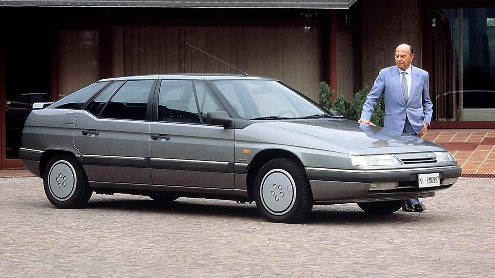
For those of you who actually made it to the end of this article, here’s a brief palate cleanser.


Yep, much better. Now there’s a wonderful XM.
Lead photo credit: BMW


To be honest at first glance I said “eh, not so bad for BMW lately” which probably is indicative of how I’ve felt about their designs the last few years.
I have a feeling that this will sell well in China… Which is probably the point.
It looks like what you’d get if you typed “angry Duplo BMW” into one of those AI image generator websites.
Those blue seats are lovely. The rest is…well… not to my tastes.
Unpopular opinion… I really like that. Especially that colour! I don’t particularly like the iX in standard form, but giving it the ful //M treatment seems to have done the trick. Its ok I’ll leave now
Lexus….”We make the world’s ugliest and most pointless SUVs”
BMW…. “Hold my beers”
That’s the same weight as the heaviest Suburban!
They let the 12 year olds loose in the styling department again. Seems that many manufacturers are hiring these nowadays.
Umm…. I kinda dig it. I really like the interior actually. The exterior definitely has some ugly angles, but if they toned down the gold trim color to make it a bit darker, I think it wouldn’t be too bad.
The former car maker BMW. This thing has an ugliness worthy of Ssangyong or Mitsuoka. I am disappointed with BMW as both the cars and motorcycles become fatter and uglier, yes I am harshing on the R18 that looks bulbous and heavy handed next to awkwardly named but lithe R nine T.
At least it doesn’t have the beaver teeth that some of the other BMWs have.
I suspect some of the ugly comes from the bling from the gold accents. All those years od getting rid of chrome cannot come to this.
I can’t wait for the estimable Mr. Clarke’s comments.
Wow, I think it’s beautiful! If you unfocus your eyes a bit it takes on that cel-shaded look that feels pulled from the page of a comic.
I agree with you that the weight is unconscionable, however.
Get thee to an optometrist
At first I thought, ‘At least it will stand out in traffic.’
Then I realized it’s only incrementally uglier than a lot of other SUVs on the road today. It will probably sell well. I look forward to battling these in my local parking lots.
In the 80’s I lusted after BMW. Someday, I told myself. Even if I won the lottery I wouldn’t by a modern BMW. Frankly, I feel that way about a lot of over-styled modern vehicles.
Those taillights are begging for a BMW logo to go between them. That poor car.
There are aspects of it I like; I just don’t think it is cohesive.
It feels a bit like one team designed a pretty clean, relatively minimalist back end (minus the debatable stacked pipes and chrome diffuser accents) and I actually really like how the back glass seems to sit flush with the surrounding body edges.
But then another team designed the front while marathoning Neon Genesis Evangelion. And somehow parts of both designs got approved!
I imagine the sides of the vehicle, which somehow manage to look ordinary and extreme at the same time, (including the unfortunate “Nebula’s eyepiece from Guardians of the Galaxy” chrome window trim,) were the valiant attempt to transition between the two different ends of this unholy union.
Good Grief!! The front grille looks like a giant pair of Swim Goggles. _:(´ཀ`」∠):_
Never mind the “Styling” all I want to know is if there is a separate subscription fee for the heated seats!
😉
Maybe you can pay a monthly fee to make it look good?
That would be cost prohibitive I’m sure!. 😉
I thought Lexus had ugly front ends…….at least the rest of a Lexus and the interiors are – well – palatable.
With the 80s and 90s cars of my youth setting the benchmark, BMW design probably lost me about 10 years ago. I keep expecting them to turn the corner again, but they just find new ways of making them look worse with every new car. What the hell, Germany.
For me, cars like BMWs are desirable mostly in that they provide a best-of-Germany experience distilled into an automobile – precision engineering, high quality materials, and apropos this, clean, sober lines.
This seems very un-Germanic.
I thought that BMW jumped the shark years ago with some of the Chris Bangle designs, but this monstrosity takes hideous to a whole new level.
The only redeeming feature is the color, which I kinda like.
Did you actually get numbers on the weight difference between the V8 and the I6? Usually it’s not nearly as much as you think – I6s are long and heavy relatively.
Modern BMW design is making Chris Bangle look like a genius.
I thought it was hideous. And then I noticed the chrome strip sagging below the windows. Now I don’t know if there is a strong enough word in the English language for just how incredibly bad this is.
It’s like they took each normally-accepted styling element on an SUV and turned the weird knob up to 11 for no discernible reason other than to see what the result would look like.
Yep. Little hard to tell in the pics, but take out the chrome and look at only the glass and there is about an inch and a half of Hoffmeister kink.
Wow, guess you don’t like it. Lots of opinions / bashing about subjective items.
That is OBJECTIVELY ugly. If a transformer had hemorrhoids, that would be how they looked.
I’m not so mad at the buffoons in the BMW styling department, but at the suits who approved production.
yeah, people take styling as ‘oh, my feelings are hurt’ but the design houses have spent a century designing ways for cars to look objectively cohesive and well-formed for a reason; opinion is one thing, but for a car to actively and aggressively go against all principles of good auto design and precedent is entirely another. You may like it, but not because it looks ‘good’.
Totally agree. David Hume wrote an entire book about this back in the 18th century, noting that things taste-wise aren’t mostly subjective, and in fact, in many cases, they’re more objective than people might think, like for the reasons you nicely cite.