Judging by the number of comments and the great conversations we had below the line, you all enjoyed our redesigning the “All-American Wagon as an EV” articles. Well, because I’m nothing if not a glutton for punishment, we’re at it again.
Now, being the resident Brit around these parts, I feel a certain obligation to, as Her Majesty’s best known secret agent might quip, “keep the British end up.” Now I know we’ve had our differences in the past. You colonials tried to make tea by chucking crates of it in Boston harbor and we set fire to the White House. But that’s all behind us now right? I don’t drink tea anyway. Being an arty designer type I prefer coffee.
America’s greatest contribution to civilized society? Coffee machines in gas stations. Anyway, the point is that we’re best friends now, as evidenced by the fact that that America took the majority of British sports car exports in the fifties and sixties, before our car industry imploded in turmoil and nationalization in the seventies.

As a result of all that, when BMW bought the Rover Group, it ended up with a variety of defunct British brands, some of which the Bavarian automaker still owns. Although Jaguar and Land Rover ended up at Ford before being sold to Tata, BMW kept MINI and also Triumph and Austin Healey. Which is where we come in. I’ve often thought these were ripe for resurrection using BMW platforms and could be sold alongside MINI. And some of you lunatic commenters agree with me.

Mazda may have perfected the smaller four cylinder British roadster by actually building them properly, but the Miata lacks a certain brawny six cylinder charm don’t you think? It’s a scalpel, not a hammer. Let’s fix that by imagining a new “Big Healey”–an Austin-Healey 3000 roadster–on the platform of the BMW Z4.
The Big Healeys, as they were known, were differentiated from their predecessors by a 2.6 and latterly 3 liter six cylinder engine. They are more British than a deadpan sense of humor in a crisis. What would a modern redo look like?

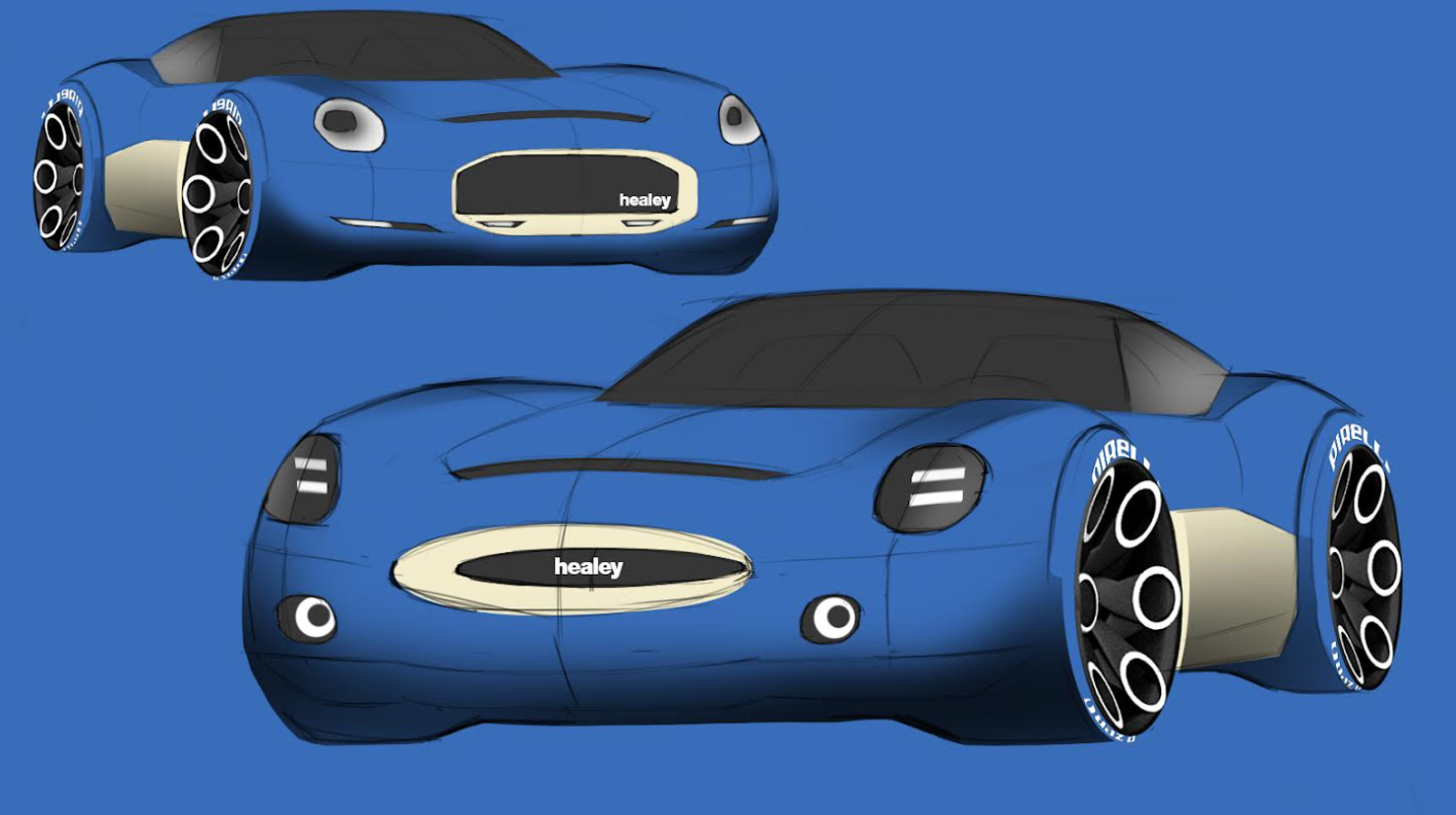
Starting at the front, I’ve tried to capture that classic round headlight look, but updating it with more modern lighting graphics. Healeys were very successful rally cars, so I’ve made sure to add in some auxiliary illumination. The tricky part was trying to avoid the grill shape looking too Jaguar like. The original car had an oval grill shape that doesn’t update easily – one alternative I haven’t sketched would be a filled-in grill with the shape indicated by a shut line.


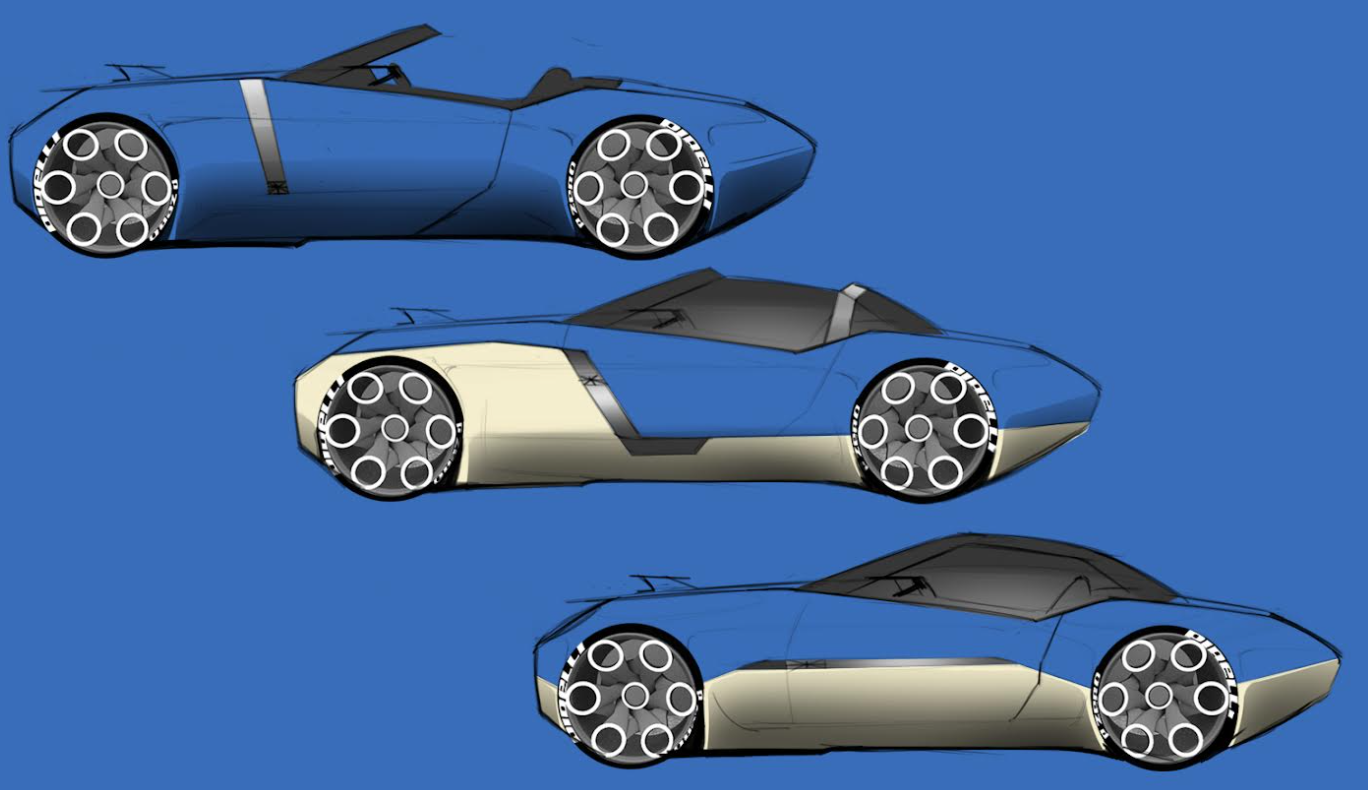
I’ve mentioned before that I normally wouldn’t sketch straight side views, as they can look static. However, in this case they’re necessary because I wanted to show alternative treatments for the two tone paint. One of the defining traits of the Austin Healey is that they taper towards the rear, much like a Citroen DS, which I’ve mimicked in the updated bodywork. The Healey really is a car that is all about that engine.

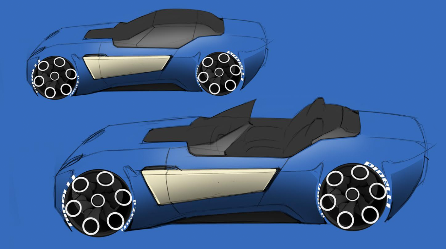
Another characteristic of those classic British roadsters is their cut-down doors. Torch threatened to beat me with a burlap sack full of odd shaped tail lights if I didn’t include this feature. [Editor’s Note: (swings bag of taillights, some sharp) – JT] If this design went forward to the realization stage the challenge would be making sure there is enough room in the door for the glass to drop fully, but I think we’ll be okay because of the low roofline.

Speaking of the roof, I’m thinking a TVR/Suzuki Cappuccino style lift out center section with a folding rear section. The beauty of the Healey’s long tail proportions means the trunk should easily be large enough to swallow the roof panel.

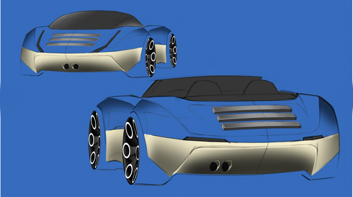
Nothing says a good time in a roadster like a picnic hamper strapped to the back. But every time I see a Miata with an old fashioned chrome luggage rack mounted on the trunk lid a piece of my car designer soul dies. So our Healey has a pop up rack that lies flush when not in use – and has a much more modern and substantial look.
As before, jump into the comments to give me your thoughts, insights and insults. Remember these thumbnail sketches are as our friend Frank would say “the concept ideation phase.” They’re getting the ideas down on the paper, not the finished concept.


Top grill, C1 style 2 tone, and I think exhaust on the left.
Not meeting side impact protection standards means no US sales. (Ducks bag of tail lights).
You probably still can. You have a smaller door opening in the structure for one. It might mean a slightly thicker door (in the Y axis) or leaving out some sound deadening or speakers.
I own a Healey 3000 but I’m not one of those ‘it was perfect don’t touch it people’. With that said, this is hideous. The sketches look like they were done in MS Paint and phoned in with every modern car designer trope imaginable; take a few design features like the hips, swage line, and mouth and accentuate them to absurdity. Then make it wider, lower, more muscular, with bigger wheels and squintier headlights. Sorry, I grade this D-.
They were done in crayon on the stall of a dive bar rest room.
“America’s greatest contribution to civilized society? Coffee machines in gas stations.”
I can’t say it’s our greatest contribution, but I do appreciate it. Or rather I did. They’re starting to take out the drip coffee makers and replacing them with industrial scale Keurigs. Now all they make is brown water of varying shades. It’s really awful and undrinkable. Gimme normal, black, coffee flavored coffee. I’m actually not very picky but just don’t as a bunch of crap to it. Or in this case actually make coffee that tastes like coffee.
We’ve come to accept the abomination of loud advertising screens in pumps. We should not let them take our coffee!
Jeremy Clarkson said our only contribution to society was the legal right turn on red.
Yeah. Forget fancy cold brews or beans that have been shit out by some Brazilian forest cat. Gimme high octane normal ground coffee and hazelnut creamer. In a big cup.
Adrian, Adrian, Adrian…I say this with respect but, as one who a) has owned three Austin-Healeys (one inherited from my father, who put more than a half-million miles on it) and b) an Old Fart, I have to say some designs are best left alone, and the Big Healey is one of them. This is, of course, an opinion; everybody has one.
Donald Healey was allegedly not happy with the design of the original Healey Hundred’s grille, which was reshaped beautifully for the 100S. By the time the car had evolved into the 3000 Mk. I, some other details had been smoothed out. But the basic shape needed nothing done to it, if you ask me. Pooched-out fenders, LED headlights and Kustom wheels just don’t fit a design from the 1950s….
Just a suggestion: please do not follow up with either an E-type or Aston Martin DBR-1 redo! The Triumph TR7, however, could use a bit of a refresh….
Here’s the thing. As Frank says (and I agree with him), imagine if it had never gone out of production. If you’re going to update it, you have to update the whole thing. It doesn’t denigrate what has gone before.
If you look at the many updated E Types that are around, they look wrong because you can’t ‘fix’ old designs by given them a modern stance and lighting. A lot of customs have this problem as well – they are over wheeled. Look at the Challenger; it’s a masterclass in how to do this sort of thing correctly.
The TR7 looks a lot better as a drop top – it’s the weird upper door and pillar treatment that ruin it.
I just realised what it is that I don’t like about the designs, and what’s wrong with them: They’re too wide.
Look at a picture of an AC Ace, then look at the Cobra: the added wheel arch flares push the width out from what ‘was’ quite a narrow car. The 50s/60s British cars were much narrower than you realise, their very low height means the width/height ratio makes them look more normal. Another example would be the Sunbeam Alpine/Tiger, or the Daimler Dart: both quite narrow cars.
But as you come towards the modern day, 2-seater sports cars followed the trend of the Cobra: wider bodywork, but staying to roughly the same height so you end up with ‘wide-looking’ cars. They also tend to look ‘short’ when they’re not. Look at the XK Jaguars… they’re long sleek things, but the designs above look stumpy and foreshortened in the 3/4 views because they’re so wide.
If you’re genuinely going to bring back British 50s/60s style, then bring the width of the vehicle down and reduce that width/height ratio a bit.
Oh also – reduce the ‘muscular-shoulders’, it’s an athlete, not a body-builder.
Agreed – a British roadster should scamper around on skinny wheels.
Seconded. This is exactly what I meant by doing away with the aggressive flaring. The little British cars were generally skinny, low things, with frontal areas so low that even with their generally poor drag coefficients, they still end up overall being more aerodynamic than most modern cars. Take a similarly low frontal area, but make the drag nice and slippery with modern aerodynamics knowledge, keep the luxury features to a bear minimum while keeping mass down to sub-Miata levels, and you’d have a modern Costin Nathan, Lotus Elite, Ginetta G4, Lotus 11, ect. But with a modern inline 6 putting out somewhere near 300 horsepower.
It. Would. Fly.
And it would sip, not guzzle, fuel.
You’re not wrong – I actually saw a Daimler Dart at a local show at the weekend and they, along with all in period sports cars, are tiny.
You’d never be able to do a car that cramped these days. The Miata is about the most shrink wrapped car you can get (excluding Kei cars like the Honda S660). I had an NC for three years, and I personally wouldn’t want an interior more snug than that, and I’m a tall skinny bitch (6’2″ and about 160lbs). I’ve not driven an ND but I know they are tighter.
You’ve got to remember a car like this has the powertrain stuffed well back – the gearbox (much bulkier than those old four speed units) is pushed between the passengers, forcing the seats out in the Y axis.
It’s all about the packaging – even the bare minimum of modern conveniences takes up a lot more volume than they used to, and that’s before you get into crumple zones, passenger clearances (they have to be a certain distance from hard points like the header rail, steering wheel etc).
Would the packaging be easier in an electric vehicle? logic says it most likely would, even if you’re working off a skateboard chassis.
I understand about the safety features being an issue as well.
As niceladybadjeep says: reducing the tyre width is a good first point for reducing the overall width of the vehicle.
The EV skateboard is a bit of a misleading idea – that you can cram everything an EV requires into a flat chassis and it frees up lots of room in the package. EVs have a lot more stuff than just batteries and motors – power control units, heat management systems, onboard chargers, regulartors etc etc – and you still have suspension, HVAC, electrical systems and so on an ICE car has. All this stuff has tolerances and clearances ie. you have to allow room for vibration and heat expansion and contraction, room for suspension to operate, tyres to turn.
Too many straight lines. Like trying to draw an E-type on an Etch-A-Sketch. The curves are what made the original so sexy, why not incorporate them? The two-tone needs to swoop down rather than make a jagged edge.
As for the grille, look at the original Healey 100. Looks like a picture of a diamond, totally iconic.
Also, needs wire wheels.
Loving the concept here, but I’d really like to see a slightly more realistic style to the proportions. It looks like the seats are fully reclined, the driver would literally not be able to see over the ginormous hood. It’s kinda like General Grevious’ starfighter in Star Wars.
Modern huh? If it’s electric, will it leave a puddle of electrons on your garage floor? Will it include some fiddly bit that makes it not start/power on at the most inopportune or embarrassing time? Will the gauges be “approximate” in all their measurements?
Most importantly, will it make passers-by stop, stare, and offer stories of “one they had” or “one their parents/grandparents had?”
Trying to capture the intangible while actually making a profit seems impossible these days. Regulatory requirements kill almost all the beauty and lightness these cars had. Lack of utility limits the market.
Go save an old one. Show them to kids at every opportunity. Let them sit in it. Let them take pictures. Make new car people.
Gotta find a way for the speedo and tach needles to wiggle around rather than give a constant reading, too.
I took the Mondial to a local show at the weekend, and let three young kids sit in it and take pictures. They’ll be telling their friends at school about that for weeks.
I like the offset tailpipes better than the centered ones. It’s more in keeping with that old British car feeling. (I know the E-Type had centered exhaust pipes, but none of the others did.)
It’s probably damn near impossible these days, but one of the coolest features of big Healeys in my mind is the adjustable-angle windscreen. It was also easily removable. Probably not going to fly with the safety folks, but it would be cool.
For wheels, what about a modern iteration of the Dunlop mags that were common on D-type Jags and MGA twin-cams?
“For wheels, what about a modern iteration of the Dunlop mags that were common on D-type Jags and MGA twin-cams?”
I like this idea.
The front looks like an unpuffed puffer fish.
That’s the top frontal treatment. The bottom one looks like a parrotfish. With the sucker wheels and all the blue, there’s a definite aquarium vibe going on.
For the love of God, don’t let Jason see those SLANTED headlights!
Great attempts at the two-tone split. It’s a hard one to crack, and I’m not sure any modern car has done it truly successfully, besides the roof-only splits.
Starting at the top of the page, I think I like the oval-grill design better than the square-mouth, but I’m not smitten by either. They feel bulkier and heavier than a Healey should. For the 2 tone paint, I like the last option. Something about the up-sweep past the rear wheel… And as for the tail, I strongly prefer the rear view with the top down, small slit lights at the waist-line.
Overall, I don’t associate this design with Healey or Triumph, but I do like it!
I thought this article would just be an image of a Miata.
Glad it’s not!
As you can see by my call name, I own an NA Miata. And as reliable and functional it is, it can’t match the soul of my old Alfa Spider. The only reason to resurrect the 3000 or the Spitfire is to bring that character back. Otherwise, it’s just the next BMW ZX – good, but non-memorable.
A thought: Would it be possible to use chrome trim to break up the surface on the front a bit? Though the only thing I can think of that does what I’m thinking is the Daihatsu Sirion and I don’t think I’d want it to look like one of those.
I say this because a lot of revival-style concepts like this, when trying to combine modern and classic, often look a little puffy. I think it might be because the modern headlights and lack of bumpers take away the required vertical elements of the old design so there’s nothing to really contrast with the smooth surfaces, and it might need an element that, er, un-smooths it a little.
Yes, trim pieces are essential to provide visual interest and prevent surfaces looking too heavy.
I like Healey 3000s and I like phone dial wheels. But together, they’re a toothpaste and orange juice experience.
Once I went to a house party and the only liquor left was Archer’s. The on;y mixer was an energy drink. That was….. a drink.
I did originally give it modernised wire wheels but I couldn’t get them to work. It looked too retro.
Turbine wheels FTW!
All cars look better with slot mags, even if it just means they look hilarious.
This is the hill I choose to die on.
what if you did wheels a bit like the Hyundai Ioniq 5, a bunch of wire-like spokes all melded together, with a little bit of curvature to them?
They’ll still be outlandish but Chip Foose put a modern rendition of wire wheels on an E-Type.
Here’s what they’d look like on this Austin Healey concept:
I’m not sure that works. The devil is really in the details with this sort of thing. If you were really set on some sort of wire wheels, you’d have to figure out a way to make them look modern. Possibly something more geometric, like you see on bikes?
I want to look closer at these but those wheels are unsettling. Not that its not a neat design, it’s just giving me the same vibes I get when I look at a Lotus Seed pod. I dont know why but they make me queasy lol
It’s called Trypophobia (trip-uh-FOE-bee-uh), it is quite common.
https://my.clevelandclinic.org/health/diseases/21834-trypophobia
I like this and I see what you mean about avoiding the E-Type “mouth”. Have a look at the original big Healey, the 100, and check out its face. It’s almost as happy as a Mk I Sprite…
I’m just glad it has a “face.” Proper Healeys always did. I loathe the current trend of making the front ends of cars look like the Predator’s helmet.
@Adrian Clarke – I think the earlier, Riley-engined Healeys have a much more interesting grille shape, carried through in a wider format on the Austin-Healey 100. Explore and report back.
Yeah that’s horrible and won’t update well. It suits the existing car, I’m not sure it would work on a new version.
It’s always about capturing the feel and the intent, rather than slavishly copying the original.
I never had a big Healey, but I owned two Sprites and am of the opinion that a new car inspired by the British roadsters of the period in question would be well worth having. I would miss the relatively light weight of the old cars, but modern power and reliability would be wonderful. Mazda has proven that a. modern roadster can be fun, other manufacturers could do the same, but probably won’t because most are focused on SUV’s.
I like where you’re going. Here’s my thoughts:
Oval grill, but bigger, and keep the traditional round lights
Lose the slotted tail lights, go with round, maybe inset, bullets
Two tone paint should only be in the cove to rear, not all the way to the front
Once you smooth the lines and come up with actual wheels I think it might just rock. Or, in British, it will do.
This might be of interest.
https://www.carmagazine.co.uk/spy-shots/austin/austin-healey-returns/
I really love the front end of this car. The side profiles sort of remind me of the Triumph Spitfire. It could use more realistically-proportioned wheels and do away with the aggressive flaring.
Man, you should totally make a coupe version of such a thing as an alternative, and don’t wuss out on making it with slippery aero, especially tapering in the rear. See the Saab Sonnet(0.29 Cd) for what a decently shaped rear might look like, at least as a starting point, or perhaps the current gen Supra as a guide, except for aesthetics, use rounded tail lights. Some of those little British sports cars, like the Costin Nathan, were almost streamliners, and could have high top speeds for their time with very little power, in the process getting excellent fuel economy.
Now, imagine such a low frontal area, low-mass thing with the powerful inine-6 engine described above, and you have the recipe for an affordable, fuel-efficient, supercar killer. The power of a new Z4 or supra, in a package that weighs around 1,200 lbs less! If you got the drag coefficient into the mid 0.2X region and a frontal area of about 1.7 m^2,in a car of around 1,000 kg, then 200 mph might be possible on 300 horsepower, and 0-60 mph would be quite Tesla-like. AND you’d get somewhere north of 40 mpg on the highway in such a beast.
I like the oval grille. The other looks too much like J. Mays ’04 Cobra concept.
https://www.motortrend.com/news/2004-ford-shelby-cobra-concept-auction/
Also, what’s up with the over-the-top wheels? Seems like you would want us paying more attention to the car design rather than the wheel design. But the wheels you keep putting on these drawings are a bit distracting, to say the least.
I think the images lack a nice set of wheels to make them pop, but I do like what I’m seeing overall. I understand an appreciate the oval grill, but the top pic just looks better for me. I like the two-tone that drops at the door. The vertical lights don’t work as well as the horizontal. Cool looking roadster.
Reminds me of the Pontiac Solstice
That ass ain’t nearly as bulbous as a Solstice.
Yet it had basically no trunk space. Sometimes GM is spectacularly bad at packaging it’s cars.
What did you think of the Solstice Coupe?
From some angles I love it, from others… not so much.
(Also, dig this modern British roadster exercise. Profile is killer, as is the two-tone paint. We need more two-tone paint.)
I loved the look of the Solstice coupe. But continuing with the abysmally unusable truck of the convertible, the coupe still didn’t have enough space to stow the targa top. GM really fucked up when it came to that parts-bin platform. But in true GM tradition where they kill off a car just as they were getting it right (see: Fiero), I would have loved to see what a second gen Kappa car would have been like. Maybe brought over as a Buick Wildcat since Pontiac and Saturn became dead?
I love the GXP I see one around town now and then, I understand completely the total impracticality, but it looks so good.
It’s really not bad at all. I would make the side window graphic a little bigger – the cant rail is a bit thick.
GM has this weird thing where they make a car that is almost brilliant looking, and then ruin it with the details, which are usually a bit thick and heavy.
I also see that